macOS has no system-wide switch that pins a window above everything else. There is no checkbox in System Settings, no modifier you can hold, and no menu item that works on an arbitrary window. The decision belongs to the application that owns the window, which is why a handful of apps can float over your work and most cannot, no matter what you do from the outside.
So your real options are these, and the rest of this piece works through each one.
- Use an app that puts its own windows on a floating level, which is the only route that survives a full-screen app.
- Use Stickies, which ships with macOS and floats over ordinary windows.
- Give the note a place of its own instead: a second display, Split View, or a Stage Manager group.
What "always on top" actually means on a Mac
Window levels
Every window on macOS sits at a level. Levels are a coarse ordering, and within one level windows stack the usual way, most recently used in front. Ordinary document windows all live at the same normal level, which is why clicking one brings it forward and pushes the last one back. Above normal there are levels for floating panels, for things the system draws, for the menu bar, and so on up.
An app that wants a window to stay visible above other apps raises that window's level. That is the whole mechanism. It is not a trick, it is not a hack, and it is not fighting the system: it is a documented property, and the window server honours it during compositing.
Two consequences follow. A raised window stays above ordinary windows from every app, not just its own. And nothing you do as a user can raise a window whose app did not ask for it, because the level is set by the app in code rather than read from a preference the system exposes to you.
Why most apps do not do it
Restraint, mostly, and it is the right default. A window that refuses to go behind anything is rude if it is large, and a full-size editor pinned over your desk makes every other app unusable. Floating suits small windows with a single job: a colour picker, a media controller, a ruler, a note. Most apps are not that shape.
You can see the same instinct in the apps that do float. They are small, they have thin chrome or none, they often go translucent, and they usually let you switch the behaviour off. The look is not a style choice so much as a consequence: a window that is always present has to earn the space it takes.
What macOS already gives you
Stickies
Stickies has shipped with macOS for a very long time, it costs nothing, it needs no account, and it keeps its notes on your Mac. Open a note, and in the Note menu you will find Float on Top. Turn it on and that note stays above ordinary windows.
That covers a real amount of ground, and for many desks it is enough. The honest limits are worth knowing before you rely on it:
- It does not follow you into a full-screen app. Take a video call, a presentation, or an editor full screen, and the note is on the desktop you left behind.
- Floating is per note, not global, so a new note starts without it unless you set it again.
- The same menu has a Translucent option, which fades the window. More on why that is a double-edged setting further down.
Assign an app to all desktops
If your problem is Spaces rather than layering, macOS has a built-in answer. Control-click, or right-click, the app's icon in the Dock, choose Options, then All Desktops. From then on that app's windows appear on every desktop Space rather than living on the one where you made them.
This is genuinely useful and often mistaken for always on top. It is not the same thing. The window still sits at the normal level, so it goes behind whatever you click next. And a full-screen app is a different kind of Space, which the next section is about.
Spaces, and what it takes to cross a full-screen one
When you send an app full screen, macOS gives it a Space of its own. That Space is deliberately exclusive: it holds that app and, for the most part, nothing else. It is why full screen feels calm, and it is also why your floating note disappears the moment you go full screen on a call.
For a window to appear over a full-screen app, its own app has to opt into two separate behaviours. One says the window can join every Space rather than belonging to the Space it was created in. The other says the window is an auxiliary that may appear over a full-screen Space. An app that sets the first but not the second follows you across ordinary desktops and then vanishes at exactly the moment you needed it.
You cannot set either of these from outside the app. There is no Dock option, no Mission Control setting, and no Terminal command that grants it to a window that did not ask. When you are choosing a notes app for this job, that pair is the specific capability to look for, and the way to test it takes ten seconds: open the note, send any app full screen, and see whether the note is still there.
Split View and Stage Manager
Split View and tiling
Split View puts two apps side by side in one full-screen Space. Hold the pointer over the green button of a window and macOS offers to tile it to one side, then asks you to pick what goes in the other half. Apple has changed the wording and expanded the tiling options between releases, so look at the menu your own Mac shows rather than the one in an old screenshot.
What you get is real: both things are visible, neither can cover the other, and it survives because it is not a layering trick at all. What you give up is flexibility. The split is two apps and no more, the divider takes real estate, and rearranging it mid task is a visible operation rather than a glance. It suits a long stretch of focused work, such as writing against a reference, better than it suits a note you consult for four seconds every few minutes.
Stage Manager
Stage Manager takes the opposite approach. Rather than keeping one window above the rest, it moves everything else out of the way, parking recent windows in a strip at the side and bringing forward the one you are using. You can drag windows together into a group so they come forward as a set, which is the part that helps here: put the note and the document in one group and they arrive together.
It is a good fit if your problem is clutter. It is a poor fit if your problem is that you want one small thing permanently visible, because Stage Manager's whole premise is that windows take turns.
Opacity, and why a translucent note becomes unreadable
Fading a floating note is a natural instinct. It is on top of your work, so you would like to see through it, and most apps that offer this do it the direct way: they lower the opacity of the window.
The trouble is that window opacity applies to everything drawn in the window. The background fades and so does the text, because the text is part of the same picture. At eighty percent you barely notice. At fifty percent the letters have lost half their contrast against a background that is now showing you whatever is underneath, and underneath is usually a busy document. The note is still there; you just cannot read it without leaning in, and a note you have to lean in to read is one you stop using.
What you actually want is for the paper to fade and the ink to stay. That requires the app to treat the background and the text as separate layers and to fade only the first. It is a noticeable difference in daily use: at thirty percent the desk shows through the note while every word stays crisp and black.
If you are evaluating an app on this, the test is simple. Turn the opacity down to something aggressive, put a dense page behind the note, and try to read a sentence. Whether the text fades with the window is obvious within a second, and it tells you which of the two implementations you are looking at.
Choosing between a floating note, a second display, and Split View
| Approach | Survives a full-screen app | Works on one display | Needs another app |
|---|---|---|---|
| Stickies with Float on Top | No | Yes | No, it ships with macOS |
| App assigned to All Desktops | No | Yes | No |
| Split View or tiling | It is the full-screen arrangement | Yes | No |
| Stage Manager group | No, windows take turns | Yes | No |
| A second display | Yes, the other screen keeps working | No | No |
| A note app with a floating window level | Yes | Yes | Yes |
A way to read that table: pick by how often you look at the note, not by how important it is.
- A glance every few minutes is the floating case. A checklist, a talk track, a phone number you have to read out, the shape of the argument you are writing. You want it present and small, and you want it there in full screen, because that is where calls and presentations happen.
- Continuous reference is the Split View case. Transcribing, translating, writing against a spec, comparing two documents. You are reading both halves constantly, and a small floating window would be too small.
- All day, unrelated is the second display case. Chat, a dashboard, a terminal tailing logs. It is not competing with your main work for attention, so give it its own glass.
The three are not exclusive. A second display plus a floating note is a common and good setup, because the floating note handles the things that must be in front of you now and the second display handles the things that must merely be visible.
How HushNotes handles it
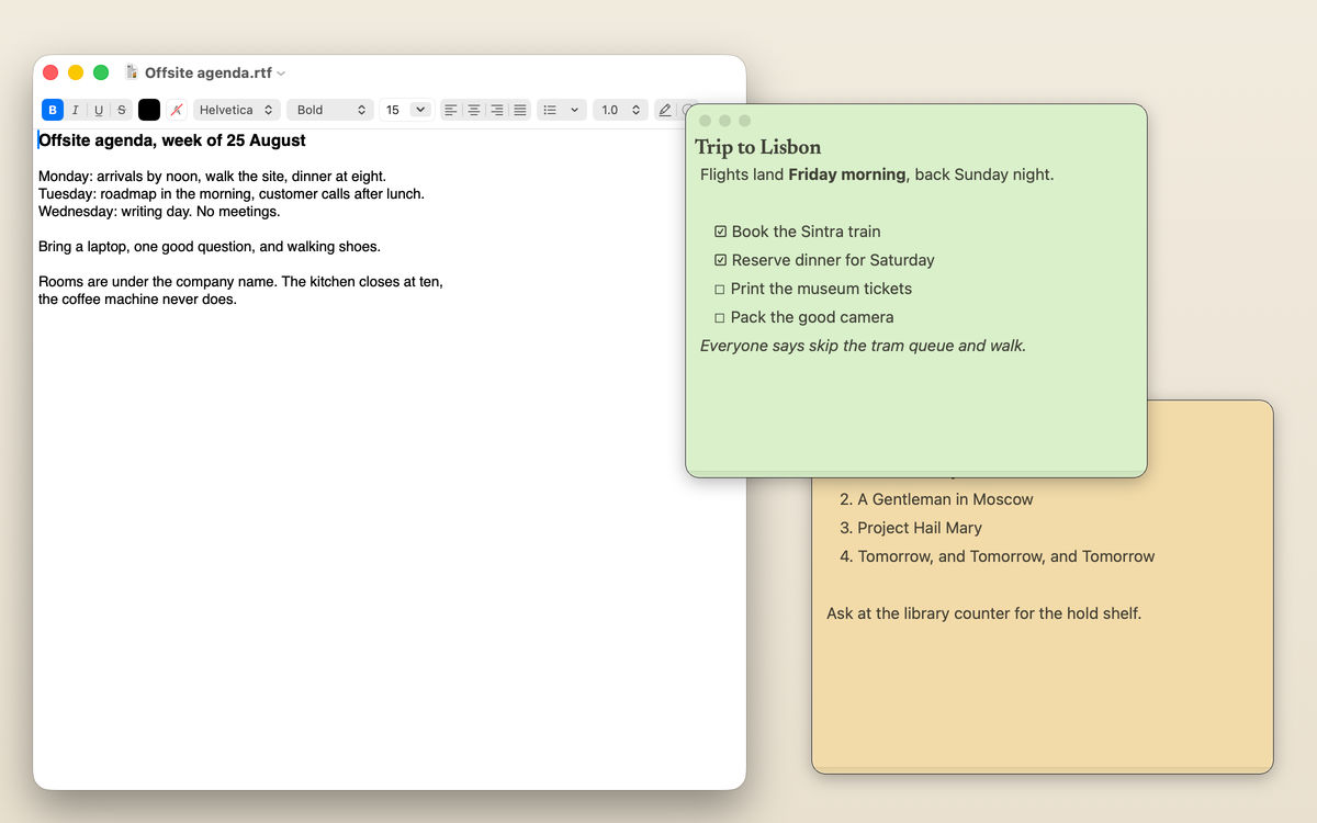
HushNotes puts its notes on a floating level and opts into both Spaces behaviours, so a note stays above your work including full-screen apps. That is a setting you can switch off if you would rather notes behave like ordinary windows.
The notes themselves are chromeless rounded cards with no title bar and no traffic lights: the note is the window. Title, pin, options and close live in a drawer that slides down when you hover, so nothing takes space until you reach for it. Opacity is per note, from ten percent to a hundred, and it fades the paper and the material behind it rather than the ink, which is the distinction the section above is about. There are six paper tints, positions are remembered per note, a note can roll up to a single line, and windows are rescued back onto the screen if a display goes away.
Two chords do most of the work. ⌥⇧N makes a new floating note. ⌥⇧H hides every note at once and brings them all back exactly where they were, which is the thing you want when somebody walks over to your desk. By default several notes share one window as a deck you swipe between, with dots along the bottom; turn one-note-at-a-time off and each note gets a window of its own.
The floating notes page has the rest of it in screenshots, and /compare/ sets it against the other ways of solving this.
Was $14.99 now $9.99, pay once · macOS 14 or later